
How to use triangle.plot in R from ade4 is an essential skill for anyone working with compositional data in R. The triangle.plot function from the ade4 package offers a simple yet powerful way to visualize three-variable systems. This type of plot, also known as a ternary plot, is commonly used to represent proportions of three variables that sum to one, often referred to as compositional data.
In many scientific fields, such as environmental science, geology, and market research, researchers need to understand the relationships between three components. The triangle plot is a perfect solution for visualizing how these components interact with each other. It provides a clear and intuitive way to show the relative proportions of each variable in a dataset.
In this blog post, we’ll walk through how to use triangle.plot in R from ade4, covering everything from setting up the package to customizing the plot for better clarity. By the end, you’ll be able to create stunning ternary plots that effectively communicate your data.
What is a Triangle Plot?
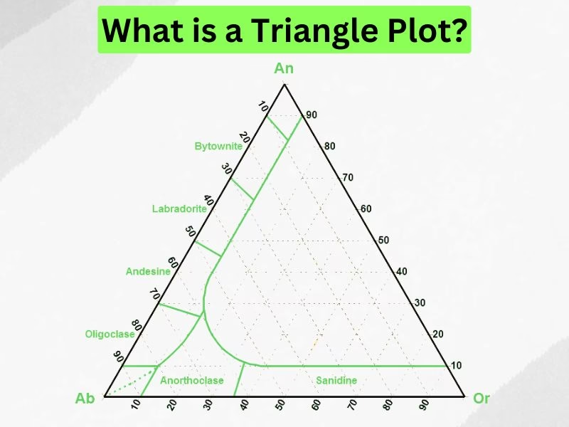
A triangle plot, or ternary plot, is a unique graphical representation of a three-variable system where each variable is expressed as a proportion of the total, summing to 1. Each point on the plot represents a combination of the three variables. This type of plot is particularly useful for visualizing compositional data — datasets where each observation is a composition of three parts.
In a triangle plot:
- The three axes of the plot represent the three components of the data.
- The plot is equilateral (in the case of normalized data), meaning that each axis represents one-third of the total.
- The positions of points within the triangle give a direct representation of how each variable contributes to the total sum.
For example, in environmental science, you might use a triangle plot to represent the percentage composition of three soil types in a particular sample. Each point on the plot would show the relative amounts of the three soil types in that sample.
Here’s how the plot looks:
- Each axis of the triangle corresponds to one of the three components.
- The corners of the triangle represent extreme cases where one component is 100%, and the other two components are 0%.
- Points within the triangle show combinations of the three variables.
This type of plot is an excellent choice when you need to compare the relative proportions of three related variables or examine how those proportions change across different observations.
Installing and Setting Up the ade4 Package in R
Before you can create a triangle plot using triangle.plot in R from ade4, you need to install and load the ade4 package. The ade4 package provides a wide range of tools for data analysis and visualization, including triangle.plot, which is specifically designed to visualize ternary data.
Step 1: Install the ade4 Package
If you haven’t installed the ade4 package yet, you can easily do so from CRAN. Open your R console or RStudio and run the following command:
install.packages("ade4")
This command will download and install the ade4 package from CRAN, making it available for use in your R environment.
Step 2: Load the ade4 Package
Once the package is installed, you need to load it into your R session using the library() function. This makes all functions from the ade4 package, including triangle.plot, available for use.
library(ade4)
Now, you’re ready to start using the triangle.plot function!
Step 3: Check the Package Documentation
If you’re new to the ade4 package, you may want to check out the official documentation for additional functions and examples. To learn more about the triangle.plot function specifically, you can refer to the following documentation:
?triangle.plot
This will provide you with more details about the arguments, options, and usage of the triangle.plot function within the ade4 package.
How to Use triangle.plot in R from ade4
Now that we have installed and set up the ade4 package, we can start working with the triangle.plot function to visualize compositional data. The function requires a dataset where each row contains three variables that sum to 1 (or close to 1 if not normalized). Let’s go through the steps to create a triangle plot in R.
Step 1: Prepare the Data
Before using triangle.plot, we need to create a dataset with three components. The sum of each row should ideally be 1 or normalized to fit within the triangular plot.
# Example data with three components
data <- data.frame(
  comp1 = c(0.2, 0.4, 0.6, 0.3, 0.5),
  comp2 = c(0.3, 0.4, 0.2, 0.5, 0.4),
  comp3 = c(0.5, 0.2, 0.2, 0.2, 0.1)
)

# Check that each row sums to 1
rowSums(data)
If your dataset does not sum to 1, you may need to normalize it:
# Normalize data
data_normalized <- t(apply(data, 1, function(x) x / sum(x)))
Step 2: Generate a Basic Triangle Plot
Once the data is prepared, we can create a basic triangle plot:
triangle.plot(data, main = "Basic Triangle Plot")
This will generate a ternary plot where each row of the data represents a point in the triangular coordinate system.
Customizing the Triangle Plot
The default triangle plot may not always be visually appealing or informative. Customizing the labels, colors, and point symbols can enhance the clarity and readability of the plot.
1. Adding Axis Labels
By default, the plot does not label the three axes. You can manually assign labels to indicate what each axis represents:
triangle.plot(data, labels = c("Component 1", "Component 2", "Component 3"), main = "Triangle Plot with Labels")
2. Changing Point Symbols
To change the appearance of the data points, use the pch argument, which controls the point style.
triangle.plot(data, pch = 19, main = "Triangle Plot with Custom Symbols")
3. Coloring the Data Points
Using different colors can help differentiate between multiple groups in the dataset.
triangle.plot(data, col = "blue", pch = 19, main = "Triangle Plot with Blue Points")
You can also assign different colors to different points:
colors <- c("red", "blue", "green", "purple", "orange")
triangle.plot(data, col = colors, pch = 19, main = "Triangle Plot with Multiple Colors")
4. Adjusting Point Size
To make points larger or smaller, use the cex argument:
triangle.plot(data, cex = 1.5, pch = 19, col = "red", main = "Triangle Plot with Larger Points")
With these customization options, you can modify your ternary plot to best suit your data and presentation needs.
Working with Multi-Dimensional Data in R
While the triangle plot is useful for visualizing three-component systems, it can also be extended for multi-dimensional data visualization by grouping or color-coding points.
1. Adding Grouping Information
If your dataset contains different groups, you can visualize them using colored markers:
# Example dataset with grouping
data_grouped <- data.frame(
  comp1 = c(0.2, 0.4, 0.6, 0.3, 0.5),
  comp2 = c(0.3, 0.4, 0.2, 0.5, 0.4),
  comp3 = c(0.5, 0.2, 0.2, 0.2, 0.1),
  group = c("A", "B", "A", "B", "A") # Group labels
)

# Assign colors based on group
group_colors <- ifelse(data_grouped$group == "A", "red", "blue")

# Create triangle plot with group differentiation
triangle.plot(data_grouped[, 1:3], col = group_colors, pch = 19, main = "Triangle Plot with Groups")
This approach allows you to compare different categories within the same ternary diagram.
2. Scaling the Data for Improved Visualization
Sometimes, compositional data can have small variations that make differences hard to see in a ternary plot. Scaling the data can improve visualization:
# Apply log transformation for better distribution
data_scaled <- log(data + 1)

# Plot scaled data
triangle.plot(data_scaled, main = "Triangle Plot with Scaled Data")
By using scaling techniques, you can improve the clarity of your ternary plots when working with real-world datasets.
Common Issues and How to Resolve Them
While using triangle.plot in R from ade4, users may encounter a few common issues related to data formatting, missing labels, or incorrect visualization. Below are some of the most frequent problems and how to fix them.
1. Non-Normalized Data
Problem:
If your data does not sum to 1, the plot may not render correctly, or the points may appear outside the expected triangular area.
Solution:
Normalize the data so that each row sums to 1:
data_normalized <- t(apply(data, 1, function(x) x / sum(x)))
triangle.plot(data_normalized, main = "Normalized Triangle Plot")
2. Points Overlapping or Difficult to See
Problem:
If many points are close together, it may be hard to differentiate them.
Solution:
- Adjust point size using
cex:triangle.plot(data, cex = 1.5, pch = 19, main = "Triangle Plot with Larger Points") - Use transparency to prevent overlapping points from obscuring one another:
triangle.plot(data, col = rgb(0, 0, 1, 0.5), pch = 19, main = "Transparent Points")
3. Missing Axis Labels
Problem:
By default, triangle.plot does not include axis labels.
Solution:
Add axis labels manually:
triangle.plot(data, labels = c("Component 1", "Component 2", "Component 3"), main = "Triangle Plot with Labels")
4. Misaligned Data Points
Problem:
If the data appears misaligned or spread unevenly, the issue may be related to incorrect data scaling.
Solution:
Try applying a transformation to better distribute data points:
data_scaled <- log(data + 1)
triangle.plot(data_scaled, main = "Triangle Plot with Scaled Data")
Best Practices for Creating Better Triangle Plots
To ensure your triangle.plot visualization is clear and effective, consider these best practices:
1. Choose Meaningful Labels
- Clearly label each component of the triangle plot.
- Use informative axis titles to help the audience understand the data.
2. Use Color for Differentiation
- If comparing groups within the data, use different colors to distinguish them.
- Example:
group_colors <- c("red", "blue", "green", "purple", "orange") triangle.plot(data, col = group_colors, pch = 19, main = "Triangle Plot with Group Colors")
3. Ensure Data is Properly Normalized
- Before plotting, normalize data if necessary to avoid outliers or misalignment.
4. Improve Readability with Transparency
- Overlapping points can be difficult to interpret. Using transparency helps resolve this issue:
triangle.plot(data, col = rgb(1, 0, 0, 0.5), pch = 19, main = "Triangle Plot with Transparency")
5. Consider Using Legends
- If there are multiple groups, add a legend manually to clarify what each color represents:
legend("topright", legend = c("Group A", "Group B"), col = c("red", "blue"), pch = 19)
Applications of Triangle Plots in Data Visualization
Triangle plots are widely used in various fields where compositional data needs to be visualized. Some of the most common applications include:
1. Environmental Science
- Used to analyze soil composition (e.g., sand, silt, and clay proportions).
- Helps visualize how different soil types affect water retention and fertility.
2. Market Research
- Used to study consumer behavior based on three factors (e.g., price sensitivity, brand loyalty, and product quality).
- Helps businesses understand customer preferences and market segmentation.
3. Chemistry & Geology
- Applied in chemical composition analysis, such as visualizing mineral composition in rocks.
- Used in material science to analyze the distribution of elements in different materials.
4. Finance and Risk Analysis
- Helps illustrate portfolio distribution across three different asset classes (e.g., stocks, bonds, and commodities).
- Useful in investment strategy optimization.
5. Biology & Genetics
- Used in genetic studies to visualize the proportions of three genetic traits in a population.
- Helps researchers understand evolutionary patterns.
By leveraging triangle plots, researchers and analysts can present complex relationships in an easy-to-understand format.
Conclusion
Triangle plots (also called ternary plots) are a powerful tool for visualizing compositional data in R. Using the triangle.plot function from the ade4 package, you can easily create these visualizations and customize them to suit your needs.
This guide covered:
- How to install and set up the ade4 package.
- How to prepare data for a triangle plot.
- Basic and advanced usage of triangle.plot.
- Customizations for improving plot clarity.
- Common issues and how to fix them.
- Real-world applications of ternary plots.
By following best practices such as normalizing data, using colors effectively, and applying transformations when needed, you can ensure your ternary plots are accurate, clear, and visually appealing.
Final Thoughts
Triangle plots are an essential tool in data analysis, offering a clear, visual representation of three-variable relationships. Whether you’re working in science, business, finance, or research, mastering how to use triangle.plot in R from ade4 will enhance your ability to analyze and present complex data.
Philip John is the dedicated admin of My Read Magazine, ensuring every article meets the highest standards before publication. With years of editorial experience, he carefully reviews each piece for accuracy, clarity, and relevance. His commitment to quality helps maintain the magazine’s reputation as a trusted and reliable source of information for readers worldwide.